Connecting Polar Researchers And Recreational Visitors
Ironhack Bootcamp Cross Over Project
Project Intro: Development of an interactive dashboard to visualize a database on Arctic mammals and climatic changes in the Arctic following the UX process using the Design Thinking methodology.
Tasks: Design an interactive Dashboard
Duration: 2 weeks
My Responsabilities: Design Thinking, UX Research, UX / Product Design
What had to be done?
For a cross over project with the students of the Data Analysts Course, I decided to choose the project „Arctic Mammals“ because it was a topic that interested me a lot. (Much more than increasing life costs that would rather depress me. But with further research for the choosed project of the changing habits of the mammals in the melting arctic was even heart breaking.)
But lets go step by step. What were the must haves?
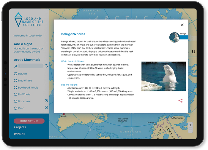
The final product was a dashboard visualizing the collected data. And the dashboard should be able to be feeded by the user. So the user should have the possibility to add and share data.
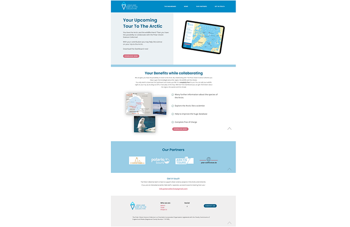
The deliveries included the dashboard, a mobile version, a landing page, a user-flow of two processes and a site-map. Of course a presentation and this case study. The time frame for the entire project was two weeks. The presentation was scheduled for the last Friday of the second week.
Research
I started with a benchmark of existing climate dashboards in general and apps for the Arctic in particular. I had to realize that there are not so many platforms for this topic.


Relatively quickly I came to various scientific researchers with the Arctic as clear evidence of climatic changes or global warming. The melting ice cover, and the migration of mammals further and further north in search of sufficient cold and ice surface.
In the same time as the tourism to the arctic is increasing in an unbelievable amount of 600% between 2006 and 2016. Round about 13.000 tourist per year are traveling to the Arctic.


In combination of polar researcher and recreational visitors it came out, that these tourists in fact are also a huge network of under-utilized engaged people who could or would participate in the framework of citizen science. At this point in real life I had contacted the ‘Polar Citizen Science Collective’, a charitable incorporated organization registered with the Charity Commission of England and Wales to seek cooperation with them.
Well, during the bootcamp training, I conducted a small survey in my environment and created the persona, her user journey and the problem statement: Victoria feels the need to collaborate as a volunteer on her trip to the arctic.
Ideation
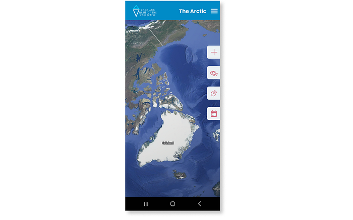
It was obvious to realize a product with a map. Especially for the possibility of integrating the own animal sightings. These sightings should either be integrated via the GPS function of the device or manually via the integrated map.
In the ideation process I build a Low-Fi-Prototype testing it more in my private environment than in the class, because my classmates didn’t belong to my target group due to their age. With the first prototypes, I was able to build the required user flows of two processes and a site-map. (For me it was a bit weird to build a site-map for supposed one-pager-dashboard.)


User Flows


Sitemap

Marketing Concept
I had come up with the following tiny marketing concept for the resulting dashboard:
- As The Polar Citizen Science Collective is in contact with the tour operators that offers their tours to the Arctic, I build the dashboard in the branding of the ‘Polar Citizen Science Collective’.
- The ‘Polar Citizen Science Collective’ would/should offers the dashboard to the tour operators
- The tour operators offers the solutions their passengers on board of the tour ship (by QR code at different touchpoints p.e.)
The financing of the project depends on the different governmental / european / global / public funds / subsidies to provide financial support for environmental and scientific projects. With a sufficient budget, the following can also be considered:
- Tour operators could lend (branded) tablets to the passengers on board with the installed dashboard
The Prototype
After testing the concept and refining with the insights of the tests I was able to build the Mid- and Hi-Fi-Prototypes.


Editorial Content
The concept tests showed that the test subjects were looking for more information about the animals, so that short descriptions of the individual species were also integrated with the support of artificial intelligence.
Portrait And Landing Page
The mandatory deliveries of course included also a portrait version, i.e. for cell phones, and a landing page.
The Outcomes
Here, too, better ready than perfect. There are many points in the prototype that still needs to be improved. And many additional ideas and potential functions. But all “customer wishes” are integrated and I am confident that the product will make a positive impression.
It’s a really good tip to create the presentation as you go through the process. This way, the presentation more or less builds itself. I still need a trick like that for the case study.
